Introducing a ‘Hide Shows’ Feature for a More Flexible Streaming Experience
Overview
I led the prototyping and design of a new feature for our iOS and Android streaming apps. The feature allows users to hide shows or movies they had previously started watching. The goal is to provide a familiar, intuitive way for users to manage their ongoing content, adding more flexibility to their experience.
The Problem
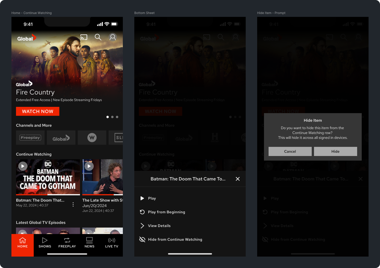
Users could either “Start from the beginning” or “Resume from where they left off” in the Continue Watching section, but there was no way to remove or hide a show they no longer wanted to see. This lack of control led to frustration, as users could not clean up their queue.
To solve this, we introduced a new action that lets users hide or remove shows while ensuring seamless interaction and alignment with mobile UI best practices. We chose a bottom sheet menu as the interaction pattern to keep the design intuitive and scalable.
Understanding User Needs
Competitive Analysis
Before diving into design, I conducted a competitive analysis to study how popular streaming platforms handled similar features. This research helped identify common patterns and user expectations, ensuring our approach felt familiar and intuitive.
Key takeaways from the analysis:
Most platforms used a bottom sheet for secondary actions, making it an expected and recognizable interaction.
A confirmation prompt helped prevent the accidental removal of content.
Simple wording reduced confusion about what “hiding” a show meant.
These insights helped shape the design decisions and reinforced the decision to use a bottom sheet to manage the “Continue Watching” section.
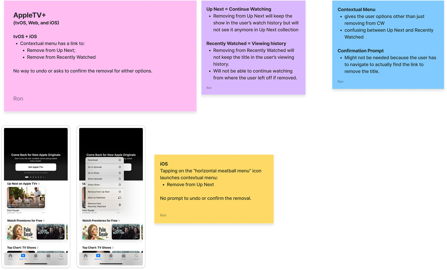
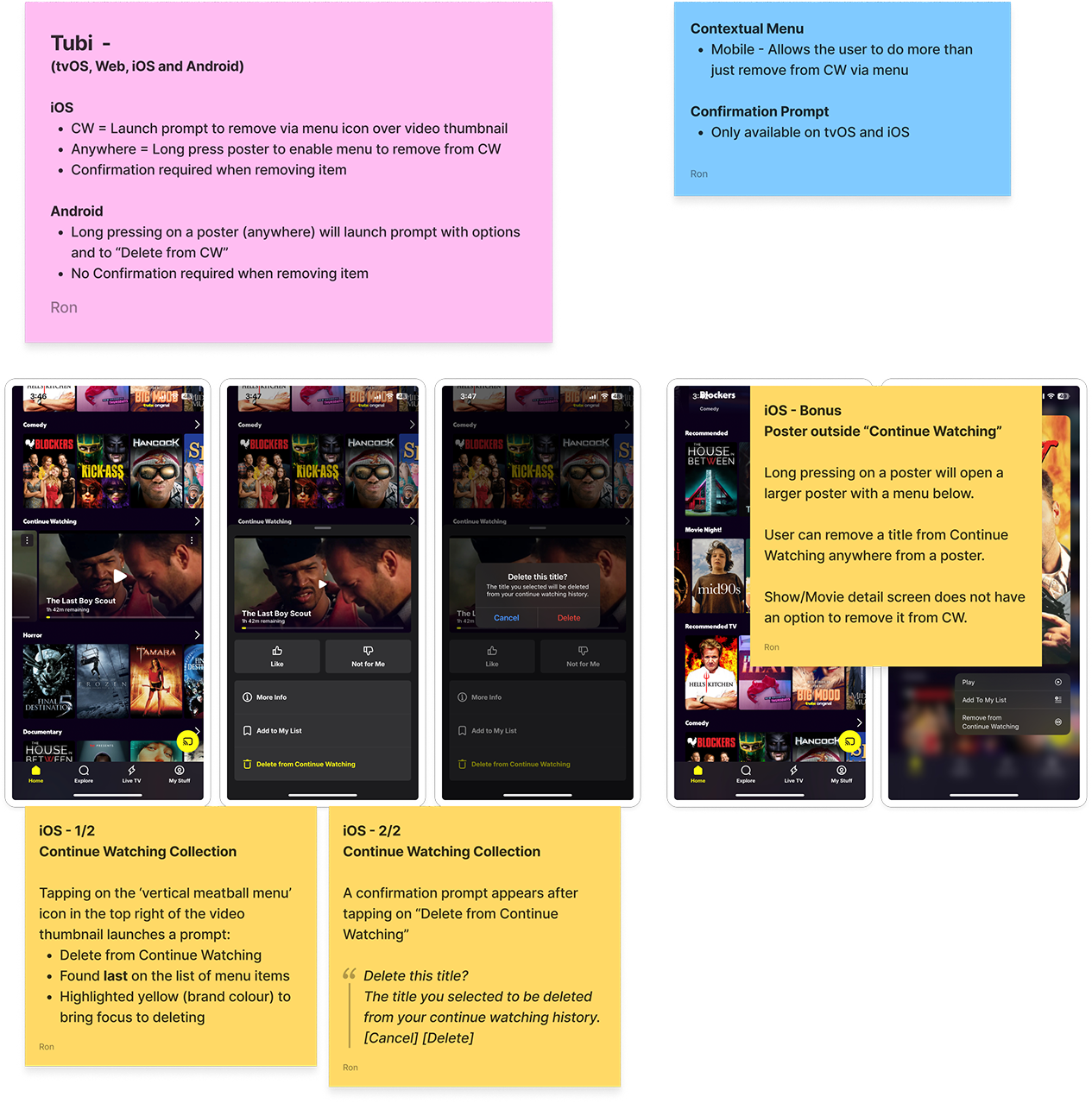
AppleTV – Competitive Analysis Notes
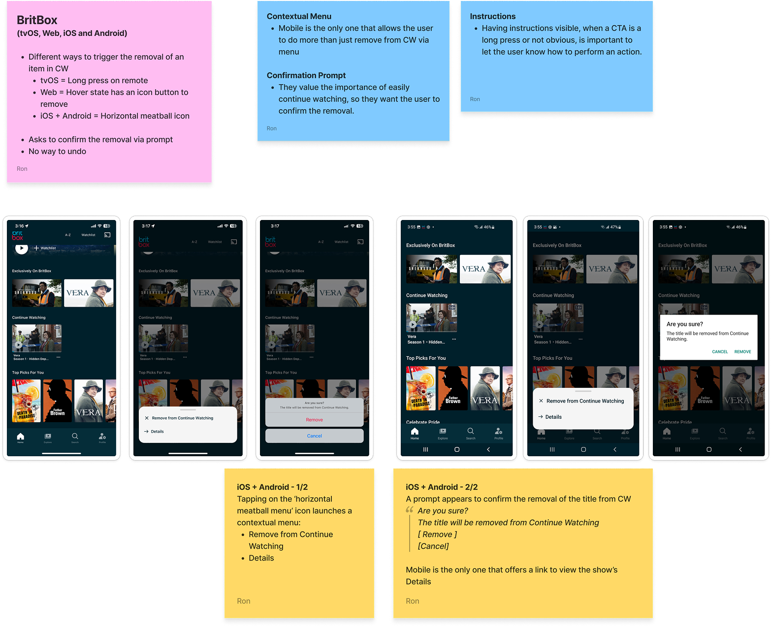
BritBox – Competitive Analysis Notes
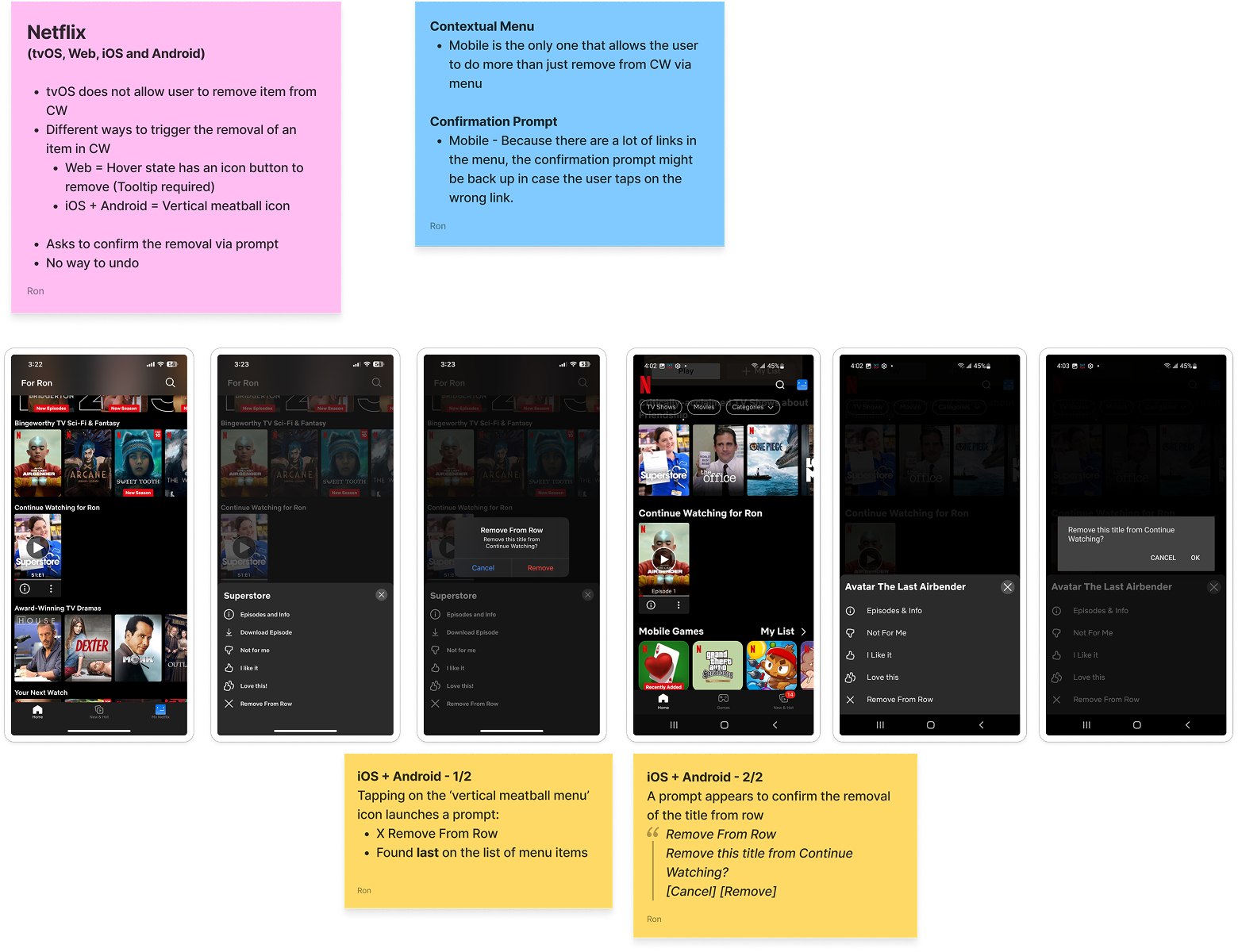
Netflix – Competitive Analysis Notes
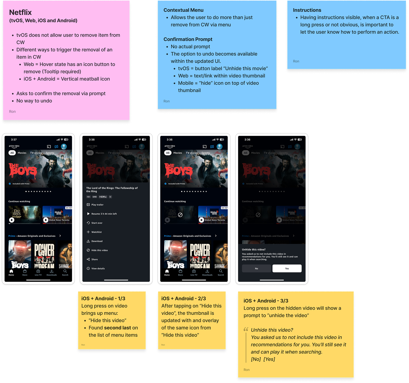
Prime Video – Competitive Analysis Notes
Tubi – Competitive Analysis Notes
Design & Prototyping Approach
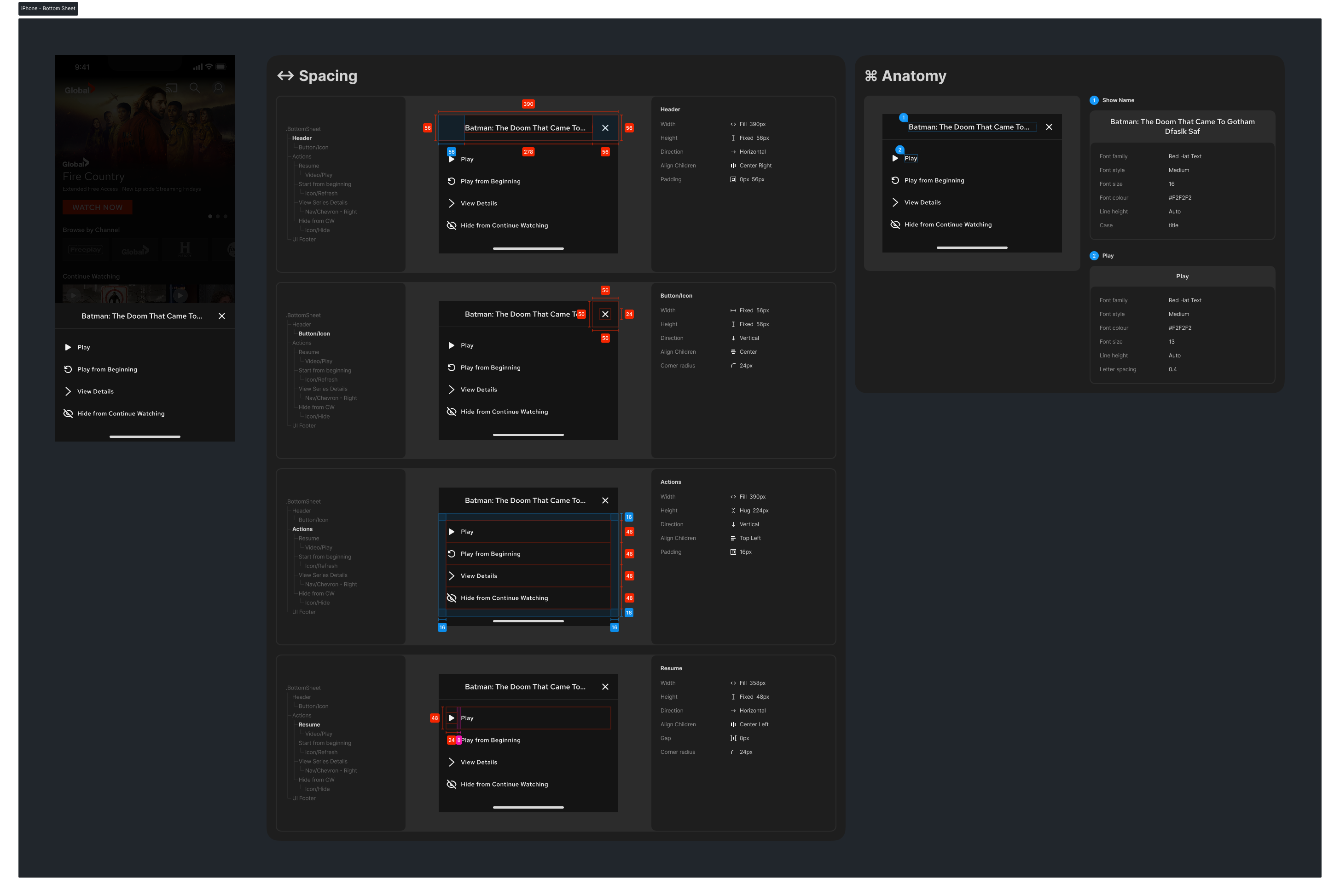
Prototyping Process
Using Figma, I iterated on different design solutions, focusing on:
Updating the mobile UI to include a new management action for previously watched shows.
Designing a bottom sheet that animates in and out, providing a list of actions (including “Hide show”).
Adding a confirmation prompt to prevent accidental actions.
I kept the design modular to align with our design system, ensuring flexibility for future updates and easy integration into existing mockups.
Stakeholder Feedback Loop
Presenting the Prototype
Once the design was refined internally, I presented the updated user flows and bottom sheet interaction to stakeholders. It was important to show:
How the new feature functioned on both phones and tablets.
How could the bottom sheet scale for future actions beyond just hiding shows?
The concept was well received. Stakeholders appreciated the bottom sheet’s flexibility and saw its potential as a scalable UI component for additional content management features.
Collaboration & Team Involvement
Developer Collaboration
I worked closely with developers throughout the prototyping process to:
Validate that the bottom sheet animations and transitions were technically feasible.
Ensure the feature is aligned with platform-specific guidelines for iOS and Android.
Preemptively identify potential performance issues before development begins.
This early collaboration helped ensure a smooth implementation while keeping technical constraints in mind.
Challenges & Adaptations
Biggest Challenge: Maintaining Consistency Without Formal User Testing
Unlike some projects that involve extensive usability testing, this feature followed established industry patterns. The challenge was ensuring our implementation felt natural and intuitive without direct user validation.
The Solution: Industry Best Practices & Internal Feedback
Instead of external testing, we relied on:
Competitive research to confirm alignment with user expectations.
Internal design reviews to refine the user flow.
Developer feedback to ensure smooth technical execution.
Following familiar UX conventions, we confidently launched the feature without delays while maintaining a high usability standard.
Final Outcome
Impact & Implementation
The Hide Shows feature was successfully implemented in iOS and Android apps, giving users a long-awaited way to manage their content. The bottom sheet interaction met the immediate goal and laid the groundwork for future content management enhancements.
Key Takeaways
Lessons Learned
Early developer involvement ensures smoother implementation, especially for new interaction patterns like the bottom sheet.
Competitive research can be a proxy for user testing when working with widely recognized design patterns.
Scalability matters. Designing the bottom sheet as a reusable component opened the door for future enhancements beyond hiding shows.
By focusing on intuitive design and cross-team collaboration, we successfully introduced a small but impactful feature that enhanced user users’ content control.