Creating a Fully Responsive Streaming Platform for Seamless Web Access
Overview
I led the design and documentation of a fully responsive website for our streaming platform, addressing the lack of accessibility for mobile and tablet users. Previously, users were forced to download the mobile app to access content, creating a frustrating barrier. The goal was to build a device-agnostic experience that allowed users to seamlessly browse and watch content directly from their web browsers.
The Problem
Our website was not optimized for mobile use. When users visited on a phone or tablet, they were redirected to download the mobile app rather than being able to engage with the content. This created:
It is a frustrating user experience for those who prefer web browsing.
Missed engagement opportunities from mobile traffic.
An inconsistent experience between web and app users.
The objective was clear: build a fully responsive website that worked across all devices. During the initial planning phase, I identified that the existing navigation system wasn’t suitable for mobile screens, making redesigned mobile navigation a key focus.
Understanding User Needs
Internal Research & Data Analysis
I used web analytics to analyze traffic patterns and validate the need for a responsive website. The data showed that:
A significant percentage of visitors accessed the site from mobile devices.
These users could not interact with the platform due to the app download barrier.
Additionally, I reviewed our mobile app’s design system, identifying UI components that could be adapted for the web to maintain design consistency across platforms.
Design & Prototyping Approach
Building a Fully Responsive Experience
I leveraged our existing design system (detailed in a separate case study) to ensure consistency and scalability. By using a mobile-first approach, I designed components that:
Adapted seamlessly across small and large screens.
Maintained functionality and readability, regardless of device.
Scaled efficiently using Figma’s auto-layout and responsive constraints.
Mobile Navigation
The biggest challenge was designing a new mobile-friendly navigation. Unlike the mobile app, the web experience lacked native gestures like swiping, requiring a different approach.
I designed a simplified browser-friendly navigation, ensuring:
Easy access to key sections without overwhelming the interface.
A sticky bottom navigation bar to improve usability on smaller screens.
Clear menu interactions optimized for touch-based browsing.
Component Prioritization for Cross-Device Usability
One of the most critical elements was the homepage content carousel, which showcases featured shows and movies. This component had to be:
Visually compelling on the desktop while remaining functional on mobile.
Optimized for touch interactions, ensuring smooth usability.
Scalable without compromising readability and engagement.
Collaboration & Feedback Loop
Cross-Team Collaboration
I worked closely with web developers to ensure the design was technically feasible. Key areas of collaboration included:
Adapting mobile app components for web implementation.
Ensuring navigation interactions worked smoothly across devices.
Optimizing the performance of large UI elements, like the carousel.
Iterative Feedback Process
After refining the design, I:
Presented the prototypes to the internal design team for feedback.
Worked with stakeholders to ensure business goals were met.
Made final adjustments based on usability concerns and technical constraints.
Challenges & Adaptations
Biggest Challenge: Creating a Unified Experience Across Web & Mobile
Since our mobile app already had a robust design, we faced the challenge of ensuring the responsive web experience felt cohesive—without simply duplicating the app.
The Solution: Selective Adaptation
Rather than copying the app UI directly, I:
Refined navigation patterns to work in a web environment.
Prioritized scalability, ensuring future updates could be easily integrated.
Identified opportunities to improve the app using what was learned from the web project.
Final Outcome
Impact & Implementation
Although the responsive website update was still in development at the time of my involvement, I successfully delivered:
Fully documented templates for desktop, tablet, and mobile.
Prototypes and design specs to guide development.
A scalable, responsive foundation that ensures accessibility across all devices.
The anticipated impact includes:
Increased user engagement from mobile web visitors.
A seamless experience between web and app users.
Improved content discovery with a redesigned navigation system.
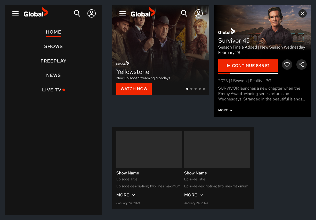
Responsive Mockups of Home Screen
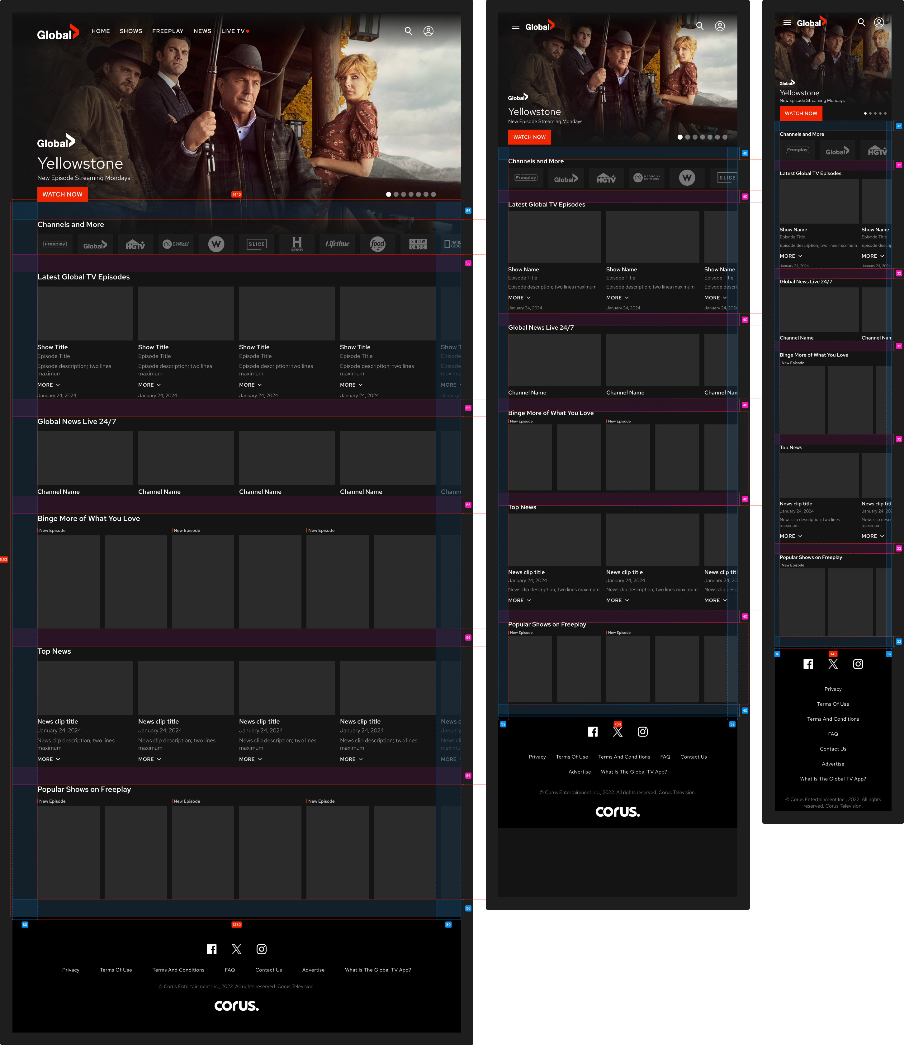
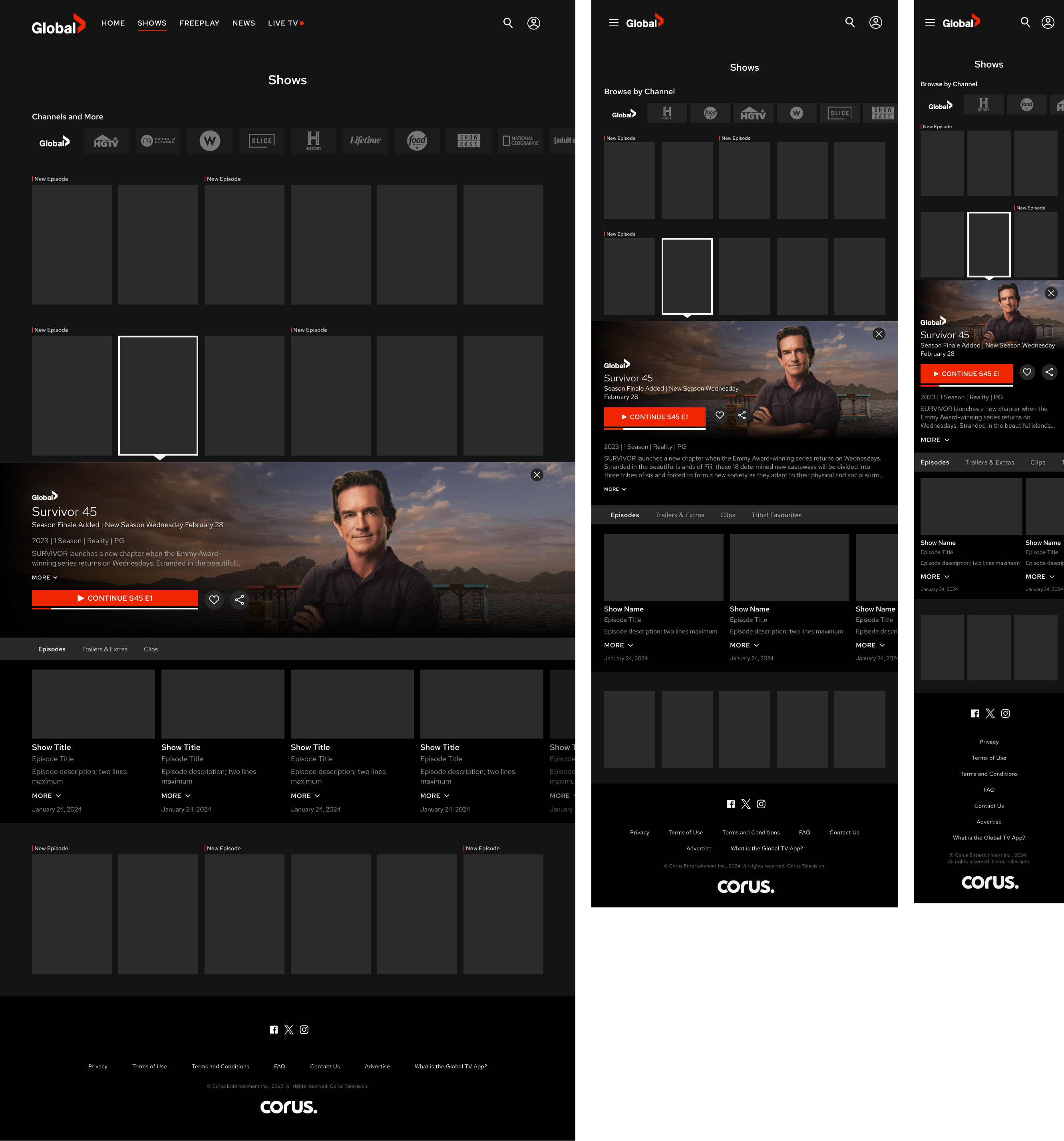
Responsive Mockups for Shows
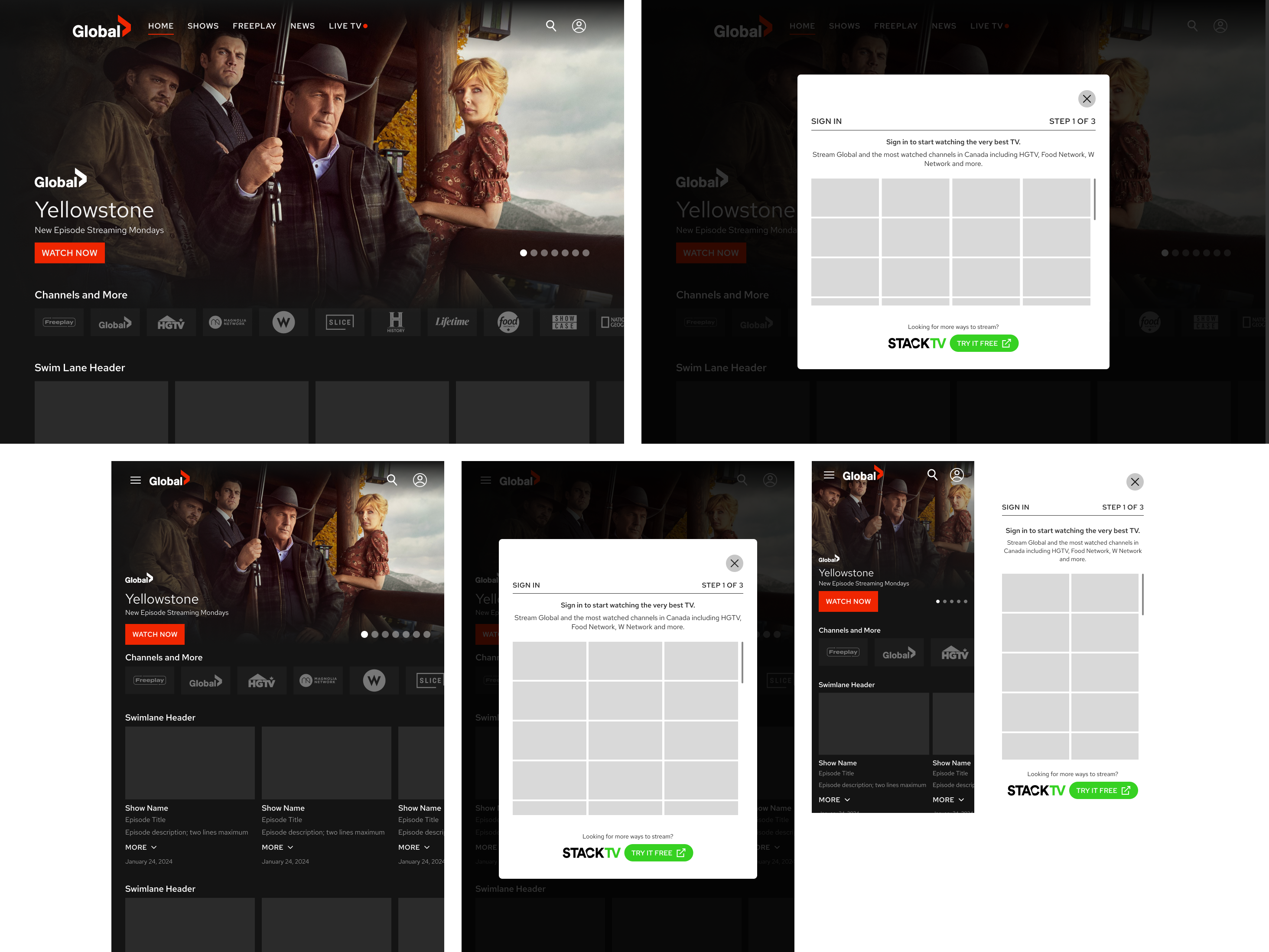
Responsive Mockups for User Sign In
Key Takeaways
Lessons Learned
Mobile-first design leads to better scalability. Starting with mobile constraints helped create a flexible, adaptable design.
Collaboration with developers is crucial. Regular check-ins helped prevent technical roadblocks.
Web and app don’t have to be identical—but they must be cohesive. Selectively adapting components ensured a smooth cross-platform experience.
This project reinforced the importance of responsive, accessible design and set the foundation for future platform enhancements.